Just Space - Accessibility Retrospective
Mon, Jul 24, 2023
Just Space was one of the first games in which Toadman Interactive, and myself, did a push for accessibility.
Even though sadly the game will currently not have a full release, I still wanted to have a look back at this initiative and see what to take with us to future games!
I'll be listing some of the most prominent settings we have in the game outside of the usual UE4 graphics settings.
And gather our take aways from the accessibility work we did for each category, things we did well, or didn't, and our learnings!
Context
What is Just Space?
Just Space was previously known and announced as Minimal Affect.
After about 4 years of development we sadly couldn't continue working on the project.
But luckily Toadman Interactive decided not to just cancel the project and hide it from the public.
Instead we got to release a little demo of the game and tell the world all about it! https://toadman.itch.io/space
So this is me telling you some stuff about it and highlighting some of the amazing work our team did!
Controls Settings

Controls Remapping
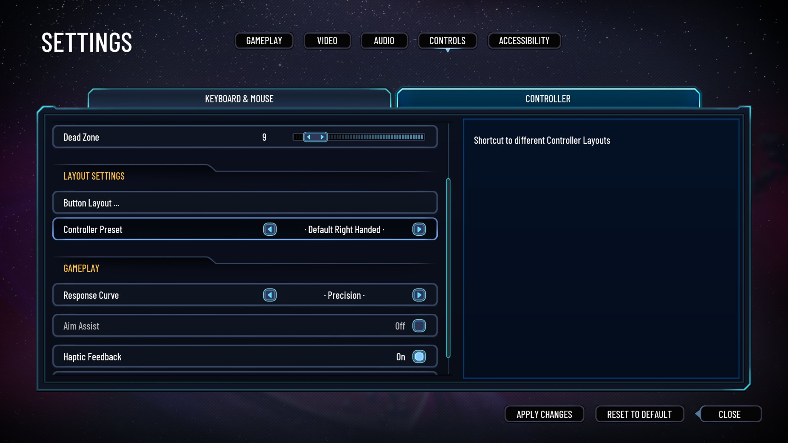
The game includes extensive controls remapping both on Mouse & Keyboard and Controllers.
All actions can be bound to anything you'd want on keyboard.
The same applies for controllers.
For controllers we also had some presets (Left handed, Right Handed, etc).
Lastly you can also assign multiple input actions to the same key, differing them by being a hold, double press, or single press action.
Customizable Deadzone
There is an user customizable joystick deadzone.
It allows you to make the game not respond to small inputs, to filter out unintended inputs.
Controller Response Curve
The game also includes a few input curve presets that would be applied to controller joysticks.
Giving players more control over how they want their joysticks to feel.
For instance you can have the input be very sensitive to small input and not very sensitive to large inputs etc.
Vibration/Haptic Feedback Toggle
This toggles the haptic feedback (vibrations) on controllers on or off.
Input Behaviors
On top of controller remapping you can also alter how some features require to be input.
Quick Cast Powers : Turning this on means you won't need to hold the button to aim where you want a power to go.
Sprint Behavior : You can either make it so you need to hold the button down to sprint, or have it be a toggle.
Aim Down Sights Behavior : You can either make it so you need to hold the button down to sprint, or have it be a toggle.
Conclusions On Controls
We were really quite happy with the controls customizabilty we ended up achieving. There were most certainly a few places of improvement still.
Including adding more general ways of controlling input behaviors (holds vs toggles etc),
and we wish we had accessibility in mind when designing the controls so we had less inputs to cram into control schemas.
Audio Settings

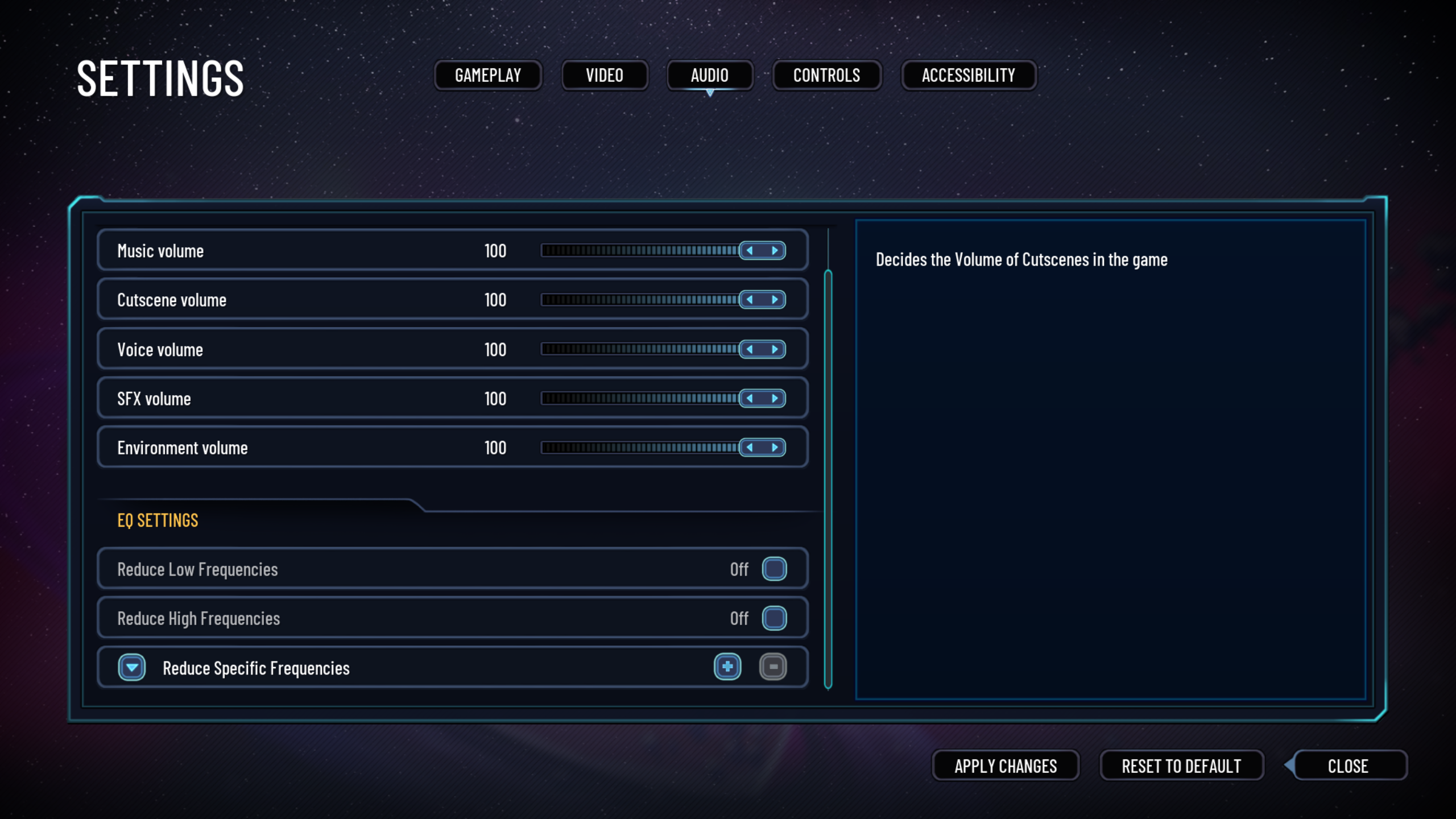
Reduce Specific Frequencies (Notches)
We introduced the ability to apply notches to the audio output.
This would reduce the volume of very narrow frequency ranges.
So if you are sensitive to certain frequencies (e.g. tinitus) or just don't want to hear them for whatever reason you can essentially remove them from the games audio.
You can apply multiple ones if you need it.
Reduce Low/High Frequencies (Low/High Pass)
We also added the ability to High & Low Pass filters to the audio.
This would reduce low or high frequencies from the games audio.
Granular Audio Sliders
There are quite a few audio sliders to customize what audio you want to hear the most.
Master, Music, Cutscenes, Voice, SFX, and Environment.
Conclusions On Audio
Audio is probably the area we had wanted the most improvements for. We did some really cool things but we never got to test them with players.
So we had no idea how useful they actually were. We also really wished we had thought more thoroughly about the audio settings granualarity from the start.
It was a lot of work to retroactively recategorize a lot of sounds.
We also had a lot of wishes for the future, like getting audio descriptions for cutscenes, more visual feedback for some audio cues, and more.
UI Settings

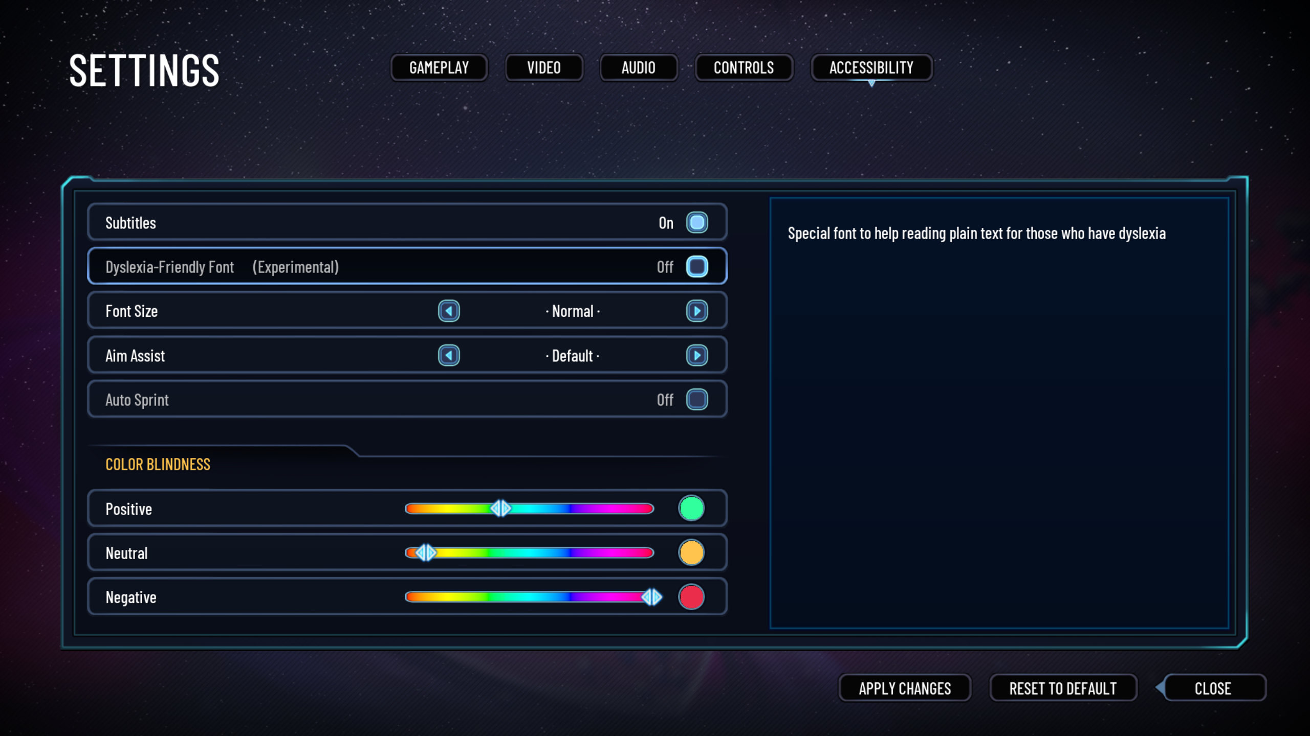
Subtitles Toggle
By default the subtitles are turned on, but this allows you to turn them off if you want.
Auto Dialogue Toggle
This toggles whether or not the dialogue will automatically progress or not.
If you turn it off you will have to press the Continue Dialogue button to progress to the next line.
Font Sizes & Types
You have the ability to change the size of the games font, from Normal to Largest.
And you can change the default font we used and replace it with a dyslexia friendly font.
UI Colors
In several places of the game we use colors to convey meaning.
In order for this to be useful for everyone you can customize which colors are actually used for this.
Conclusions On UI
There were most certainly many things we really wished we could've gotten done but I would also not like to skip over the many things we were very proud of.
We were really proud of our subtitles work, speakers name is always there, it's always on a background, font options, and color options.
The biggest thing we really wished we could've finished were the setting previews (giving players a preview of what the settings are affecting), they were quite a bit of work but they would've improved the User Experience so much.
General Design
First Launch
We used to have a popup to allow the user to set important settings upon the first launch.
This is not present in the demo build due to needing to quickly implement a thank you screen in its place.
Telegraphing
We spent quite a lot of time and effort on telegraphing, from grenades, to encounter states.
With every bit of telegraphing we did our best to convey it through both audio and visual means, never just one.
So hopefully no matter what, you would know what was happening and why.
Conclusions On Design
The general consensus is that we did some nice things for accessibilty within design but it could've been so much more.
Telegraphing was something we worked on really quite late and aim assist was also rather late.
Difficulty settings were also sadly something we never really got to implement due to time and scope constraints which is a real shame.
But we were very happy with the effort we spent making sure the player could always pause the game, no matter if they are in a cutscene, dialogue or anything.
General Conclusion
I would say a lot of the learnings from this entire project are things accessibility advocates have been telling the industry for a long time already.
The best approach to accessibility is including it as a part of your core design from the very beginning.
This ultimately redueces how much time is needed for good accessibility and also allows for a much broader implementation of it.
We also really wish we had had more time to test and research our approaches to accessibility.
Obviously with the fate of the project we didn't get to this which is a real shame. We are hoping we can get some feedback from the demo at least.
Lastly a big take away as well has been that accessibility is a responsibilty best shared among the entire team, rather than a few select people.
The more people we got into the mindset of accessibilty, the better it became.
All in all this was a wonderful learning process for the whole team, not just myself, and I think we have all become better developers because of it.
And I cannot wait for us to put this new found knowledge to work in future projects and keep on learning even more things!
Thanks!
Thanks to the whole Just Space team for creating an awesome game, and a wonderful development experience! Some special thanks to Freja Rassmuson, Véronique Rattaire, and Eirik Johansen for helping with the games accessibility initiative! Couldn't have done it without you all. 💖